> ## Documentation Index
> Fetch the complete documentation index at: https://docs.presenton.ai/llms.txt
> Use this file to discover all available pages before exploring further.
# Charts and visual content
> Create and edit charts, tables, diagrams, icons, shapes, and visual layouts.
Chart, table, image, icon, shape, and layout creation and editing use the same Standard presentation editor in Cloud and open-source Presenton.
## Generate visual content
In Cloud, the API Playground can generate presentation content from a description and exposes presentation examples beside the generation controls. In the shared editor, use the AI Assistant when a chart or table must be added to a specific slide. Identify where the visual belongs and name the source data.
> Add a line chart after slide 5 using the monthly values in the attached spreadsheet. Keep the source units and label the reporting period.
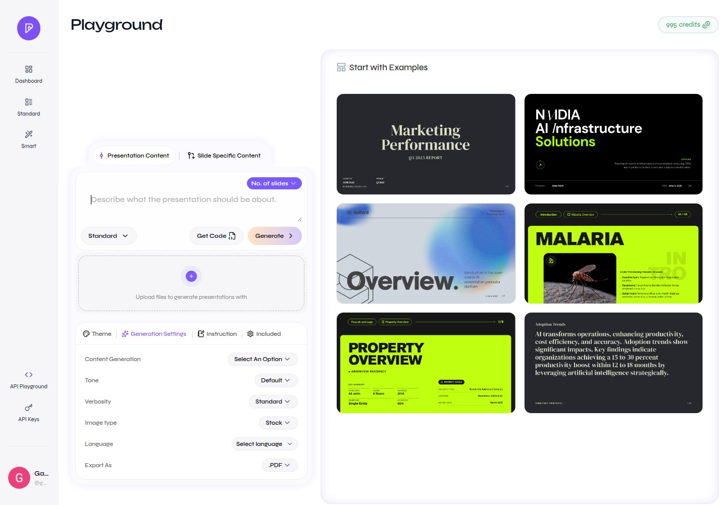
Describe presentation content and browse visual examples
## Edit charts and tables directly
Enable **Select Edit** and select the chart or table. Select a chart to open its data and customization controls. Select a table cell to edit the cell, then use the table actions to add or remove rows and columns or move a column left or right.
### Chart controls
The current Standard editor exposes these chart types:
| Chart family | Types |
| ----------------------------------- | ------------------------------------------------------ |
| Bars and columns | Bar, Horizontal Bar, Stacked Bar, Horizontal Stack Bar |
| Lines and areas | Line, Area |
| Proportions | Pie, Donut, Polar Area |
| Relationships and radial comparison | Scatter, Bubble, Radar |
Depending on the chart type, customization includes title, data values, category labels, legend, axis visibility and titles, grid visibility, axis and grid colors, and series colors. Radial and pie-like charts expose the controls that apply to their geometry.
## Choose the right form
* Use a chart when the audience needs to see a pattern, trend, or comparison.
* Use a table when the audience needs exact values.
* Use a diagram when the message is a process, hierarchy, or relationship.
* Use an image or icon when the audience needs a visual reference, object, or compact label.
## Add elements from the editor
The insert palette includes image layouts such as **Image**, **Image + Text**, and **Image Grid**; a **Simple Table**; the chart types listed above; and basic **Rectangle**, **Ellipse**, and **Line** elements. Use the AI Assistant when the visual needs to be derived from source content or placed in a specific story position.
## Review before delivery
* Recalculate source values and derived percentages.
* Confirm that axes do not distort the comparison.
* Include units, dates, category labels, and data source context.
* Check that colors remain distinguishable and text remains legible.
* Confirm that table values, chart categories, series, and source labels still match the source after editing.
* Open the exported PPTX or PDF and inspect labels for clipping.