

Edit charts and tables directly
Use a chart when the audience needs to see a pattern or comparison. Use a table when exact values matter. Add and edit both from the Canvas editor.Add and edit tables and charts
Watch the complete Canvas workflow for adding a chart and table, then editing their content directly.
- Charts
- Tables
Open Charts, then choose a chart or infographic that matches the relationship in the data.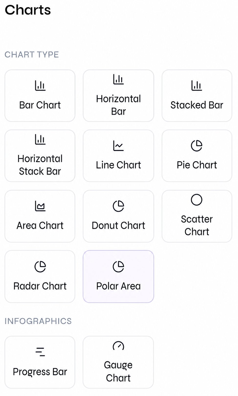
Chart and infographic types
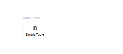
Chart controls
The Standard editor groups its chart choices by purpose:
Use bar charts for category comparison, line or area charts for change over time, pie-like charts for a small number of parts in a whole, and scatter or bubble charts for relationships between measures.
Build diagrams with icons and shapes
Combine icons, labels, shapes, arrows, and lines when the audience needs to understand a process, hierarchy, or relationship. Keep the reading direction obvious and use one visual meaning for each shape or color.Edit and replace icons
Select an icon on the slide to update its color or replace its symbol. Use Change Icon to search for a concept, compare matching symbols, choose an icon weight, and apply the replacement.Edit images and icons
Follow the Canvas guide to recolor an icon or replace it with a better symbol.
Add shapes and connectors
Open Elements to insert a rectangle, circle, ellipse, triangle, diamond, pentagon, hexagon, arrow, or line. Select the element on the canvas to move, resize, rotate, or restyle it.Edit shapes and lines
Watch the focused Canvas guide for positioning and styling shapes, lines, and connectors.
Add a reusable visual layout
Open Blocks when you need a complete slide section rather than one object. Search the block library, review the available layout variants, and select the layout that matches the content you need to present.Blocks and layout
Browse reusable block families, compare layout variants, and add a complete visual section to the active slide.
Choose the right visual form
Review before delivery
- Recalculate source values and derived percentages.
- Confirm that axes do not distort the comparison.
- Include units, dates, category labels, and data source context.
- Check that colors remain distinguishable and text remains legible.
- Confirm that table values, chart categories, series, and source labels still match the source after editing.
- Open the exported PPTX or PDF and inspect labels for clipping.